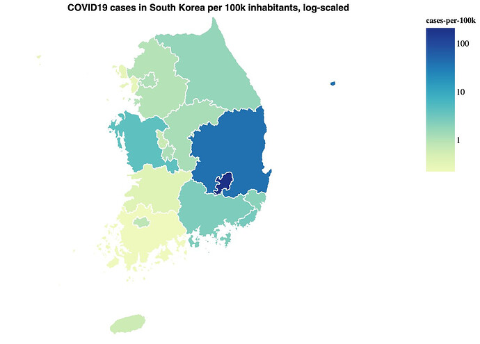
To better understand COVID-19, I visualized open data with Vega and a Clojure REPL. I wrote a blog post about it: COVID19 data in the REPL Here’s a small, static version of the Germany map:
The big reason I took the time to write this up rather than continue privately making my own visualizations was the recent SciCloj data science meetup in Berlin, before ClojureD. A common sentiment was that we should all share how we compose libraries and architecture these kinds of projects. My coronavirus exploration is a very small project, but I thought it could help towards that goal. I shared (a cleaned-up subset of) the code I used to visualize the data in this repo. I figure it may help two kinds of folks: those who could use example Clojure code for charts and maps, and those who want to see how a certain lispy, functional approach to data manipulation is done.
